
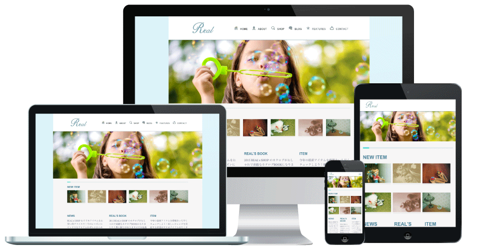
Make your site mobile-friendly with responsive design
+ Switching to the desktop view is also supported
Free Quote
Features of RWD+
Responsive Plus
With ordinary responsive web design, visitors cannot switch between the mobile and desktop views, but with RWD+, users can switch the display themselves!
No Monthly Fees
With RWD+, there are no monthly fees! Because the design is optimized with CSS, no changes are required on the system side such as your CMS, so you can go mobile-friendly at a lower cost.
Easy Operation
Because your site becomes mobile-friendly on the same URL, a single page is all you need and maintenance is simple. With RWD+, just add a few lines of code and mobile support is complete! *4
Quality Guarantee
Rather than automated conversion, we build to match your site, resulting in a high-quality responsive site. What's more, we guarantee that your site will be judged mobile-friendly by the Google Mobile-Friendly Test! *5
Benefits of Going Responsive with RWD+
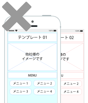
For example, tools that automatically convert desktop sites into mobile sites,
and low-cost mobile conversion services, only let you choose from a fixed set of design templates.
That is not true mobile optimization.
RWD+ makes your site responsive in a way tailored to it, ensuring both high quality and a consistent brand image.
For details, please also see our case studies.
Free Quote
Case Studies
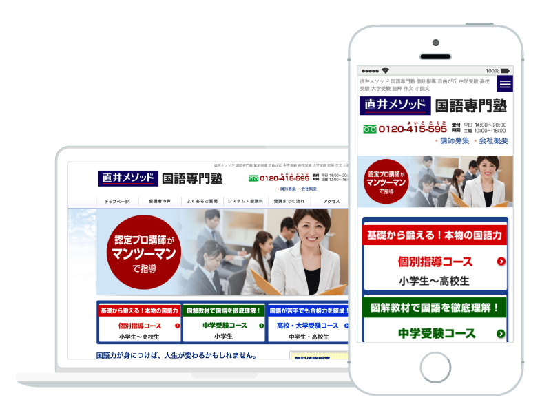
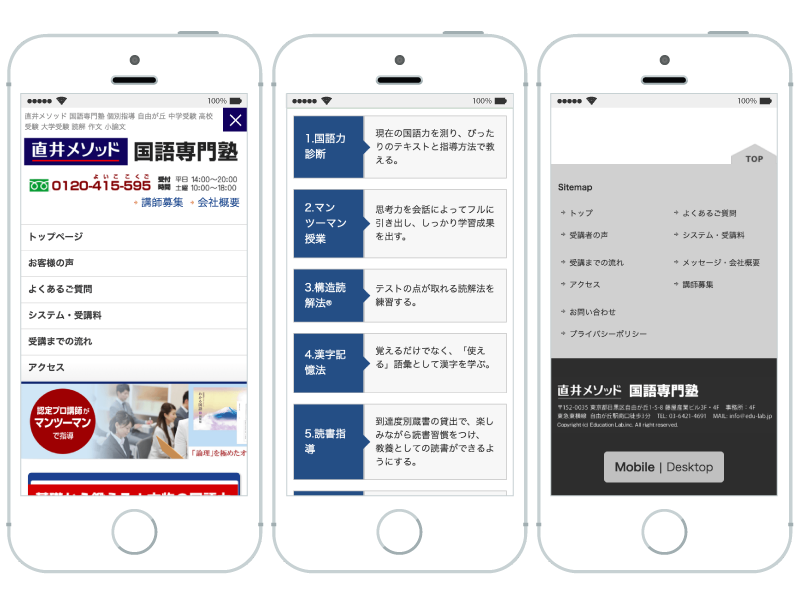
Japanese Language Cram School
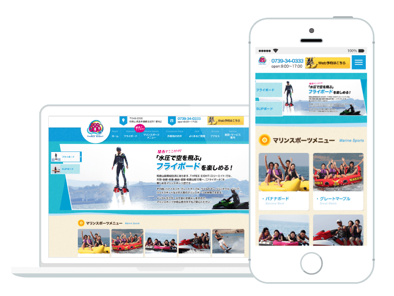
THREE EIGHT
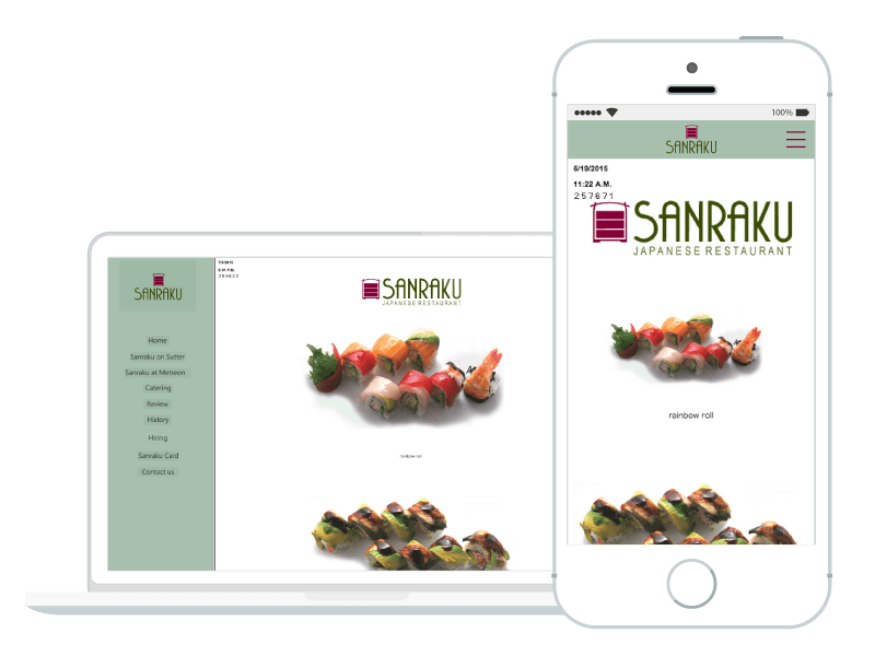
SANRAKU
Free Quote
Case Studies
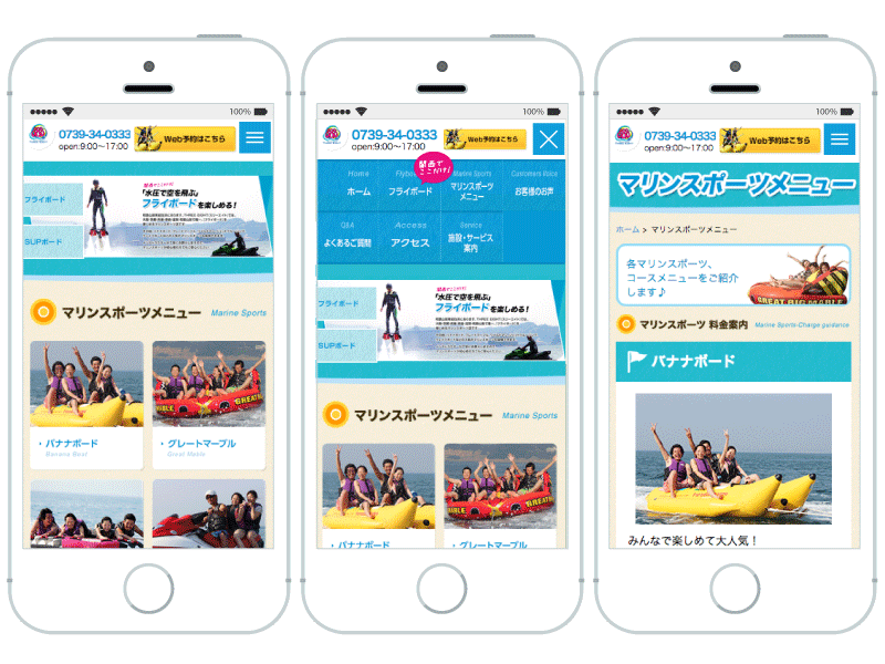
Case Studies
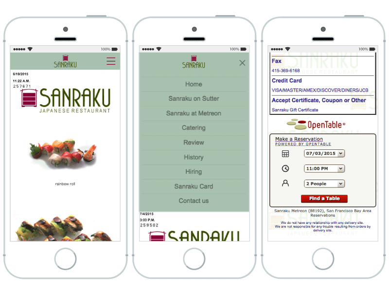
Case Studies
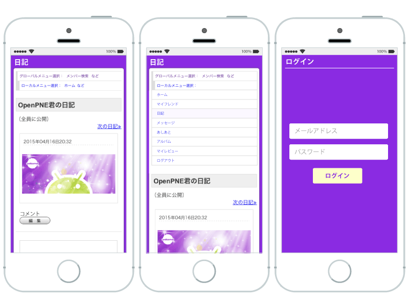
Case Studies
FAQ
Quotation
We review your site and provide a free quote: as fast as1 business day
Contract to Delivery
After the base fee is paid, we begin production immediately and deliver: as fast as7 business days
After delivery, you pay the production fee
Mobile Support Complete!
Add a few lines of code on your end and your site becomes responsive!
Mobile support is complete!
What is responsive web design (RWD)?
It is a web page production technique that changes the layout according to the screen size. Because it supports a wide range of screen sizes across many devices such as iPhone, Android, and tablets without changing the URL or HTML, it is also recommended in the
Google mobile guide .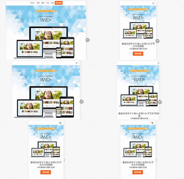
What is responsive web design plus (RWD+)?
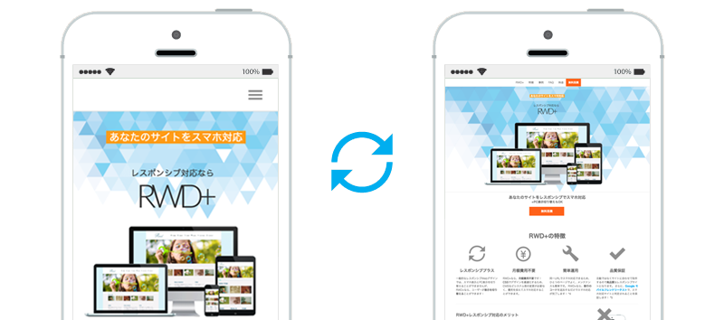
In addition to RWD, it lets visitors switch between the mobile and desktop views. When viewed on a mobile device, a view-switching link appears in the footer. With high-quality RWD+ support, we add value to your site that goes beyond simple smartphone compatibility.
Why can a site be made responsive with just a few lines of code?
Responsive web design can be implemented almost entirely with CSS. That is why the work is complete once you add code that loads the CSS file and so on. *4
We produce and deliver CSS and JavaScript files
Is the CSS just a recycled template?
No. We build it individually for each site. That is what makes high-quality responsive support possible.
Why are there no monthly fees?
ASP services that automatically convert sites into mobile sites may charge a monthly system usage fee. However, if the site itself is rebuilt as a smartphone-compatible site, no ongoing costs are required. For RWD+, we only charge the production cost of rebuilding your site as a mobile-friendly one.
Does it work with a CMS?
A benefit of responsive web design is that your site can be made mobile-friendly while leaving systems such as your CMS untouched. We have extensive experience with WordPress and Movable Type sites as well.
My site has more than 100 pages. Is that a problem?
Depending on the page content and HTML markup structure, we can usually reduce the production cost. In some cases we can handle 100 pages for the price of one page, so please feel free to contact us. For pricing models, please also see the Production Costs page.
What does it look like?
Please see our case studies. Also, if you view this page on a smartphone, you can experience the mobile-optimized menu and switch to the desktop view from the bottom of the page.
Mobile SEO
Google announced that from April 2015 it would boost the search ranking of mobile-friendly pages. *1 *2
Because mobile-friendly sites have an advantage in SEO,
they rank higher and capture smartphone users rather than losing them.
Growth in Smartphone Users
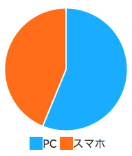
The gateway to the internet is shifting to smartphones. Smartphone use is spreading rapidly beyond younger demographics, and smartphone users now account for more than 43% of internet users. *3
Number of Smartphone Users
Free Quote
Pricing
|
With RWD+, no monthly fees!
Other companies often charge monthly, but with RWD+ you only pay the initial cost! |
|
|---|---|
| Base Fee |
¥98,000
Campaign discounts available! |
| Production Fee |
From ¥10,000/page
Quoted based on page content and other factors *6 |
| Support | |
| Desktop View Switching | |
| Quality Guarantee |
We guarantee your site will be judged mobile-friendly by the Google Mobile-Friendly Test *5 |
| RWD+ Comprehensive Options | |||
|---|---|---|---|
| Tablet Support | From 10,000/page | SEO Improvements | From 10,000/page |
| Animation Support | From 10,000/page | Social Buttons | From 10,000/page |
| E-commerce Support | Quoted separately if required |
New Build / Renewal | Quoted separately |
*1: Official Google blog, Official Bing blog *2: Nikkei, "Google's mobile search algorithm change is set to have an impact" *3: 2014 Nielsen report *4: Depending on the page content, additional modifications may be required. *5: We may be unable to guarantee results depending on the page content or changes to Google's specifications. *6: We quote based on the number of pages, markup structure, and other factors. Depending on the structure, we may be able to handle 100 pages for the price of one page, so please feel free to contact us.
Free Quote
Feel free to contact us even just for a consultation or a question.
Your data is sent securely with SSL encryption