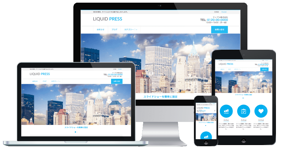
LIQUID PRESS Free Design Skins & Parts
LIQUID PRESS DESIGN SKIN&PARTS-
LIQUID PRESS Design Skins & Parts
* Going forward, please use the Blocks & Patterns plugin!
We have released the Block Pattern Gallery - just copy and paste!
Some of the designs now support block style designs!
For conversation-style speech balloons, there is a plugin that lets you create speech-balloon conversations.
A collection of code snippets that make design changes and layout creation easy with the LIQUID PRESS Hybrid Theme (Version 1 and later). No template editing or plugin installation is required. Everything can be set up easily from the admin screen, and it is all completely free to use.
How to Use
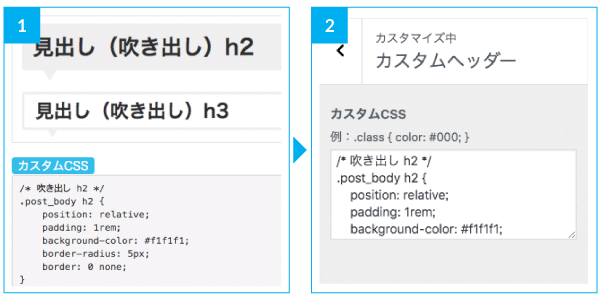 1. Click the "Custom CSS" or "HTML" button for the design you like, and the code will be displayed.
2. For "Custom CSS", enter the code under Customize > "Custom CSS". For "HTML", enter the code in the post "Text editor" or in a "Custom HTML" widget.Click any design image to open the actual sample page.
* If HTML tags are not reflected correctly, try removing the line breaks, or set Customize > Options > Automatic tag insertion to "No" and check again.
* Please note that use of the Design Skins & Parts is outside the scope of our support.
-
Text
You can decorate text.
 HTML
HTML
Indicates <mark>highlighted text</mark>.
Indicates <s>struck-through text</s>.
Indicates <u>underlined text</u>.
-
Headings
You can change the design of headings within an article.
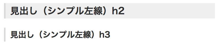
Enter the code for the design you like in Custom CSS.Simple Left Border
 Custom CSS
/* Simple left border h2 */
.post_body h2 {
    background-color: #f1f1f1;
    border-bottom: 0 none;
    border-left: 5px solid #ddd;
    padding: .5rem 1rem;
}
.post_body h2>span {
    border: 0 none;
    padding: 0;
    margin: 0;
}
/* Simple left border h3 */
.post_body h3 {
    border-bottom: 0 none;
    border-left: 5px solid #ddd;
    padding: .5rem 1rem;
}
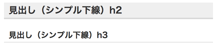
Simple Underline
 Custom CSS
/* Simple underline h2 */
.post_body h2 {
    background-color: #f1f1f1;
    border-bottom: 5px solid #ddd;
    padding: .5rem 1rem;
}
.post_body h2>span {
    border: 0 none;
    padding: 0;
    margin: 0;
}
/* Simple underline h3 */
.post_body h3 {
    border-bottom: 2px solid #ddd;
    padding: .5rem 1rem;
}
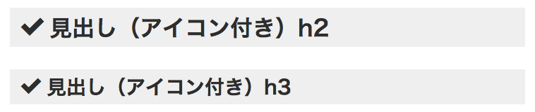
With Icon
 Custom CSS
Tip
Custom CSS
Tip
/* With icon h2 */
.post_body h2 {
    background-color: #f1f1f1;
    border: 0 none;
    padding: .5rem 1rem;
}
.post_body h2>span {
    border: 0 none;
    padding: 0;
    margin: 0;
}
.post_body h2>span:before {
    font-family: 'icomoon';
    font-weight: normal;
    speak: none;
    display: inline-block;
    content: "\ea10";
    padding-right: .5rem;
}
/* With icon h3 */
.post_body h3 {
    background-color: #f1f1f1;
    border: 0 none;
    padding: .5rem 1rem;
}
.post_body h3:before {
    font-family: 'icomoon';
    font-weight: normal;
    speak: none;
    display: inline-block;
    content: "\ea10";
    padding-right: .5rem;
}
From the icon font list, specify the code beginning with "e" for the icon you want in the content property.
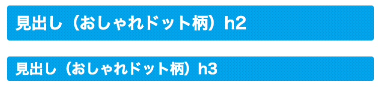
Stylish Dot Pattern
 Custom CSS
/* Stylish dot pattern h2 */
.post_body h2 {
    color: #fff;
    background: #00aeef;
    background-image: radial-gradient(#00a0dc 20%, transparent 0), radial-gradient(#00a0dc 20%, transparent 0);
    background-position: 0 0, 3px 3px;
    background-size: 6px 6px;
    padding: 1rem;
    border: 0 none;
    border-radius: 5px;
}
.post_body h2>span {
    border: 0 none;
    padding: 0;
    margin: 0;
    vertical-align: bottom;
}
/* Stylish dot pattern h3 */
.post_body h3 {
    color: #fff;
    background: #00aeef;
    background-image: radial-gradient(#00a0dc 20%, transparent 0), radial-gradient(#00a0dc 20%, transparent 0);
    background-position: 0 0, 3px 3px;
    background-size: 6px 6px;
    padding: .5rem 1rem;
    border: 0 none;
    border-radius: 5px;
}
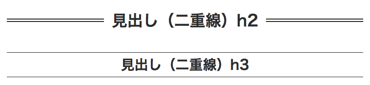
Double Line
 Custom CSS
/* Double line h2 */
.post_body h2 {
    position: relative;
    text-align: center;
    border: 0 none;
    background-color: transparent;
}
.post_body h2>span {
    position: relative;
    z-index: 2;
    background-color: #fff;
    padding: 1rem;
    border: 0 none;
}
.post_body h2:before {
    display: block;
    color: transparent;
    content: ".";
    border-top: 2px solid #333;
    position: absolute;
    top: 46%;
    width: 100%;
}
.post_body h2:after {
    display: block;
    color: transparent;
    content: ".";
    border-top: 2px solid #333;
    position: absolute;
    top: 54%;
    width: 100%;
}
/* Double line h3 */
.post_body h3 {
    border-top: 1px solid #333;
    border-bottom: 1px solid #333;
    text-align: center;
    padding: .5rem;
}
Speech Balloon
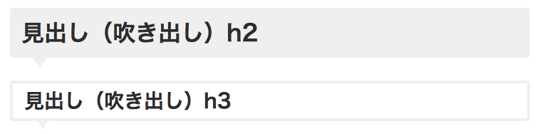 Custom CSS
/* Speech balloon h2 */
.post_body h2 {
    position: relative;
    padding: 1rem;
    background-color: #f1f1f1;
    border-radius: 5px;
    border: 0 none;
}
.post_body h2:after {
    position: absolute;
    top: 100%;
    left: 2rem;
    content: '.';
    width: 0;
    height: 0;
    border: 10px solid transparent;
    border-top: 15px solid #f1f1f1;
    color: transparent;
}
.post_body h2>span {
    border: 0 none;
    padding: 0;
    margin: 0;
}
/* Speech balloon h3 */
.post_body h3 {
    position: relative;
    padding: .5rem 1rem;
    border-radius: 5px;
    border: 4px solid #f1f1f1;
}
.post_body h3:after {
    position: absolute;
    top: 100%;
    left: 2rem;
    content: '.';
    width: 0;
    height: 0;
    border: 10px solid transparent;
    border-top: 15px solid #f1f1f1;
    color: transparent;
}
Ribbon Style
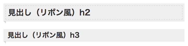 Custom CSS
/* Ribbon style h2 */
.post_body h2 {
    position: relative;
    padding: .5rem;
    background-color: #f1f1f1;
    border-width: 0 0 1px 0;
    border-bottom: 1px solid #ddd;
}
.post_body h2 span {
    display: block;
    padding: .5rem;
    border: 2px dashed #ddd;
}
.post_body h2:before {
    position: absolute;
    content: '.';
    color: transparent;
    border-style: solid;
    border-color: transparent;
    height: 10px;
    width: 10px;
    top: 100%;
    left: 0;
    border-width: 0 10px 10px 0;
    border-right-color: #ddd;
}
/* Ribbon style h3 */
.post_body h3 {
    position: relative;
    padding: .5rem 1rem;
    background-color: #f1f1f1;
    border-width: 0 0 1px 0;
    border-bottom: 1px solid #ddd;
}
.post_body h3:before {
    position: absolute;
    content: '.';
    color: transparent;
    border-style: solid;
    border-color: transparent;
    height: 10px;
    width: 10px;
    top: 100%;
    left: 0;
    border-width: 0 10px 10px 0;
    border-right-color: #ddd;
}
Stripes
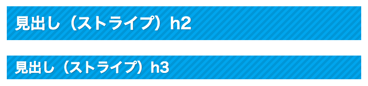 Custom CSS
/* Stripes h2 */
.post_body h2 {
    padding: 1rem;
    background: -webkit-repeating-linear-gradient(-45deg, #00aeef, #00aeef 5px, #00a0dc 5px, #00a0dc 10px);
    background: repeating-linear-gradient(-45deg, #00aeef, #00aeef 5px, #00a0dc 5px, #00a0dc 10px);
    color: #fff;
    text-shadow: 1px 1px 1px rgba(0, 0, 0, .3);
    border: 0 none;
}
.post_body h2>span {
    border: 0 none;
    padding: 0;
    margin: 0;
}
/* Stripes h3 */
.post_body h3 {
    padding: .5rem 1rem;
    background: -webkit-repeating-linear-gradient(-45deg, #00aeef, #00aeef 5px, #00a0dc 5px, #00a0dc 10px);
    background: repeating-linear-gradient(-45deg, #00aeef, #00aeef 5px, #00a0dc 5px, #00a0dc 10px);
    color: #fff;
    text-shadow: 1px 1px 1px rgba(0, 0, 0, .3);
    border: 0 none;
}
With Subtitle
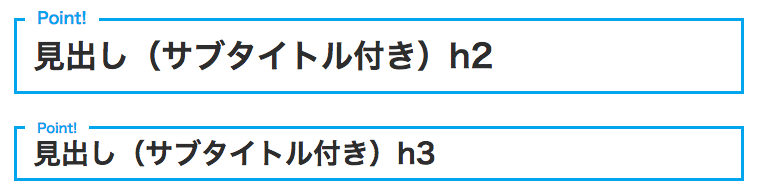 Custom CSS
/* With subtitle h2 */ .post_body h2 { position: relative; padding: 1rem; border: 3px solid #00aeef; background-color: transparent; } .post_body h2:after { content: "Point!"; /* Subtitle */ position: absolute; top: -.7rem; left: .5rem; background: #fff; font-size: medium; color: #00aeef; padding: 0 .75rem; display: inline-block; } .post_body h2>span { border: 0 none; padding: 0; margin: 0; } /* With subtitle h3 */ .post_body h3 { position: relative; padding: .5rem 1rem; border: 3px solid #00aeef; } .post_body h3:after { content: "Point!"; /* Subtitle */ position: absolute; top: -.5rem; left: .5rem; background: #fff; font-size: small; color: #00aeef; padding: 0 .75rem; display: inline-block; } -
Headings (Font Size)
You can change the font size without using h tags.
Using structural headings (h tags) and size-only headings (p tags) appropriately also helps with SEO. -
Share Buttons
You can change the design of the share buttons.
Enter the code for the design you like in Custom CSS.Full Width
 Custom CSS
/* Share buttons */
.detail_text > .share {
    display: -ms-flexbox;
    display: flex;
    justify-content: space-evenly;
}
.detail_text > .share a {
    width: 100%;
    margin: 0;
    text-align: center;
    text-decoration: none;
}
Larger Buttons
 Custom CSS
/* Share buttons */
.detail_text > .share a {
    text-align: center;
    text-decoration: none;
    padding: 1rem;
    border-radius: .25rem;
    box-shadow: 0 1px 1px 1px #ccc;
}
Extra Large Buttons
 Custom CSS
/* Share buttons */ .share_clone > .share a { width: 32%; margin: 0 0 .5rem 0; padding: 1rem 0; text-align: center; text-decoration: none; font-size: medium !important; } -
Alerts
You can display alerts.
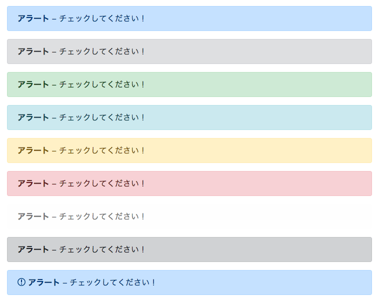 HTML
Tip
HTML
Tip
<div class="alert alert-primary" role="alert"><strong>Alert</strong> - Please check this!</div>
<div class="alert alert-secondary" role="alert"><strong>Alert</strong> - Please check this!</div>
<div class="alert alert-success" role="alert"><strong>Alert</strong> - Please check this!</div>
<div class="alert alert-info" role="alert"><strong>Alert</strong> - Please check this!</div>
<div class="alert alert-warning" role="alert"><strong>Alert</strong> - Please check this!</div>
<div class="alert alert-danger" role="alert"><strong>Alert</strong> - Please check this!</div>
<div class="alert alert-light" role="alert"><strong>Alert</strong> - Please check this!</div>
<div class="alert alert-dark" role="alert"><strong>Alert</strong> - Please check this!</div>
<div class="alert alert-primary" role="alert"><i class="icon-notification"></i> <strong>Alert</strong> - Please check this!</div>
Placing this as a "Custom HTML" widget in the "Headline" area will display it at the very top of the site.
-
Badges
You can display badges.
 HTML
HTML
<span class="badge text-bg-primary">Badge</span>
<span class="badge text-bg-secondary">Badge</span>
<span class="badge text-bg-success">Badge</span>
<span class="badge text-bg-info">Badge</span>
<span class="badge text-bg-warning">Badge</span>
<span class="badge text-bg-danger">Badge</span>
<span class="badge text-bg-light">Badge</span>
<span class="badge text-bg-dark">Badge</span>
<span class="badge text-bg-primary liquid_bg">Theme Color</span>
-
Buttons
You can display buttons.
 HTML
HTML
<a class="btn btn-primary text-white" href="#" role="button">Button</a>
<a class="btn btn-secondary text-white" href="#" role="button">Button</a>
<a class="btn btn-success text-white" href="#" role="button">Button</a>
<a class="btn btn-info text-white" href="#" role="button">Button</a>
<a class="btn btn-warning text-white" href="#" role="button">Button</a>
<a class="btn btn-danger text-white" href="#" role="button">Button</a>
<a class="btn btn-light" href="#" role="button">Button</a>
<a class="btn btn-dark text-white" href="#" role="button">Button</a>
<a class="btn btn-primary btn-lg text-white" href="#" role="button">Large</a>
<a class="btn btn-primary btn-sm text-white" href="#" role="button">Small</a>
<a class="btn btn-primary liquid_bg liquid_bc text-white" href="#" role="button">Theme Color</a>
-
Shadows
You can add shadows.
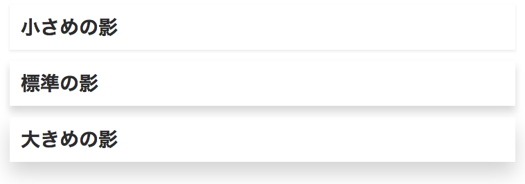 HTML
HTML
<h3 class="shadow-sm p-3">Small shadow</h3>
<h3 class="shadow p-3">Standard shadow</h3>
<h3 class="shadow-lg p-3">Large shadow</h3>
-
Images
You can change the appearance of images. There is no need to edit the images themselves.
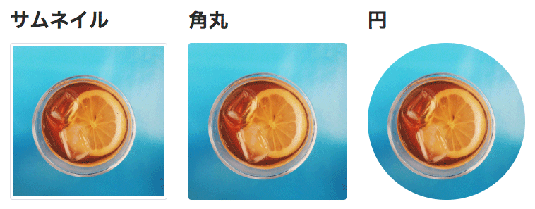 HTML
HTML
<img src="example.jpg" alt="Thumbnail" class="img-thumbnail">
<img src="example.jpg" alt="Rounded corners" class="rounded">
<img src="example.jpg" alt="Circle" class="rounded-circle">
-
Column Layouts
You can create column layouts.
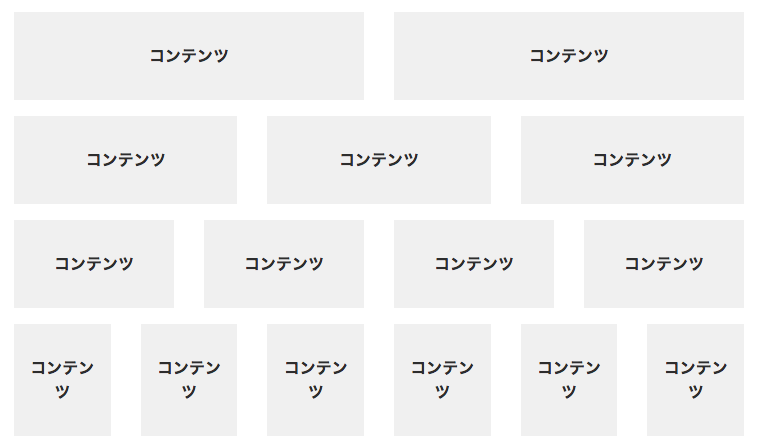 HTML
Tip
HTML
Tip
<div class="row">
    <div class="col">
        <div class="eg">Content</div>
    </div>
    <div class="col">
        <div class="eg">Content</div>
    </div>
</div>
<div class="row">
    <div class="col">
        <div class="eg">Content</div>
    </div>
    <div class="col">
        <div class="eg">Content</div>
    </div>
    <div class="col">
        <div class="eg">Content</div>
    </div>
</div>
More complex column arrangements and device-size-specific display are also possible. For details, please refer to the Bootstrap 4 documentation.
-
Column Layouts (No Gutters)
You can create column layouts with no gutters.
 HTML
Tip
HTML
Tip
<div class="row no-gutters">
    <div class="col">
        <div class="eg">Content</div>
    </div>
    <div class="col">
        <div class="eg">Content</div>
    </div>
    <div class="col">
        <div class="eg">Content</div>
    </div>
    <div class="col">
        <div class="eg">Content</div>
    </div>
    <div class="col">
        <div class="eg">Content</div>
    </div>
    <div class="col">
        <div class="eg">Content</div>
    </div>
</div>
Adding no-gutters removes the spacing. When using it in a full-width area, wrap it in the container below.
-
Containers
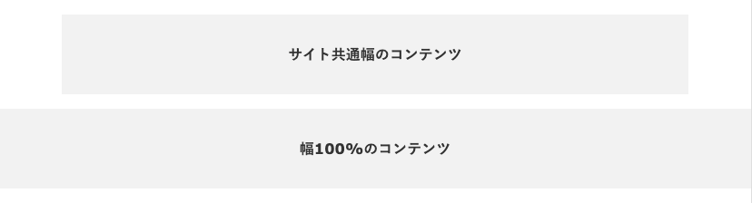
When placing content, you can apply the site's common width.
-
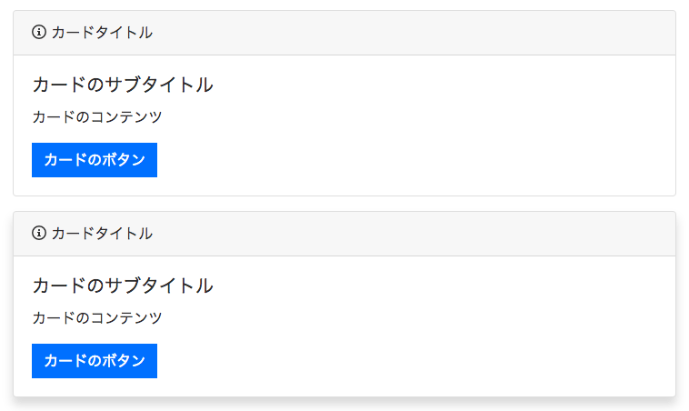
Cards
You can create card-style elements.
 HTML
Tip
HTML
Tip
<!-- Card -->
<div class="card">
  <div class="card-header">
    <i class="icon-info"></i> Card title
  </div>
  <div class="card-body">
    <h5 class="card-title">Card subtitle</h5>
    <p class="card-text">Card content</p>
    <a href="#" class="btn btn-primary text-white">Card button</a>
  </div>
</div>
<!-- Card (with shadow) -->
<div class="card shadow">
  <div class="card-header">
    <i class="icon-info"></i> Card title
  </div>
  <div class="card-body">
    <h5 class="card-title">Card subtitle</h5>
    <p class="card-text">Card content</p>
    <a href="#" class="btn btn-primary text-white">Card button</a>
  </div>
</div>
Adding shadow applies a drop shadow.
-
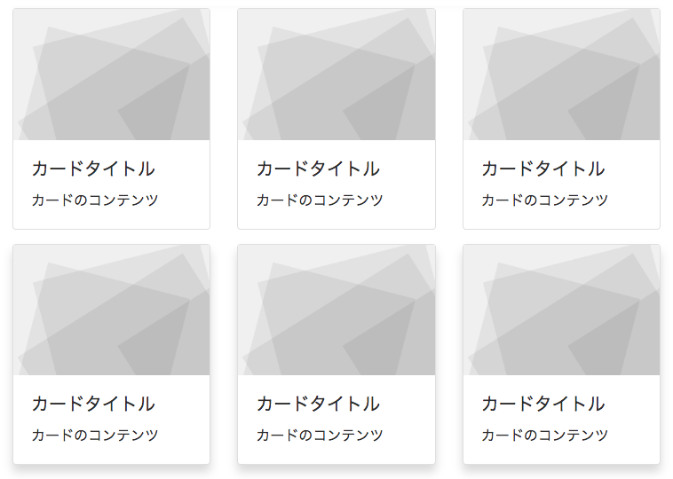
Card Groups
 HTML
Tip
HTML
Tip
<!-- Card group -->
<div class="card-deck">
  <div class="card">
    <img class="card-img-top" src="https://get.lqd.jp/wp/light/wp-content/themes/liquid-light/images/noimage.png" alt="Card image cap">
    <div class="card-body">
      <h5 class="card-title">Card title</h5>
      <p class="card-text">Card content</p>
    </div>
  </div>
  <div class="card">
    <img class="card-img-top" src="https://get.lqd.jp/wp/light/wp-content/themes/liquid-light/images/noimage.png" alt="Card image cap">
    <div class="card-body">
      <h5 class="card-title">Card title</h5>
      <p class="card-text">Card content</p>
    </div>
  </div>
  <div class="card">
    <img class="card-img-top" src="https://get.lqd.jp/wp/light/wp-content/themes/liquid-light/images/noimage.png" alt="Card image cap">
    <div class="card-body">
      <h5 class="card-title">Card title</h5>
      <p class="card-text">Card content</p>
    </div>
  </div>
</div>
<!-- Card group (with shadow) -->
<div class="card-deck">
  <div class="card shadow">
    <img class="card-img-top" src="https://get.lqd.jp/wp/light/wp-content/themes/liquid-light/images/noimage.png" alt="Card image cap">
    <div class="card-body">
      <h5 class="card-title">Card title</h5>
      <p class="card-text">Card content</p>
    </div>
  </div>
  <div class="card shadow">
    <img class="card-img-top" src="https://get.lqd.jp/wp/light/wp-content/themes/liquid-light/images/noimage.png" alt="Card image cap">
    <div class="card-body">
      <h5 class="card-title">Card title</h5>
      <p class="card-text">Card content</p>
    </div>
  </div>
  <div class="card shadow">
    <img class="card-img-top" src="https://get.lqd.jp/wp/light/wp-content/themes/liquid-light/images/noimage.png" alt="Card image cap">
    <div class="card-body">
      <h5 class="card-title">Card title</h5>
      <p class="card-text">Card content</p>
    </div>
  </div>
</div>
Adding shadow applies a drop shadow.
-
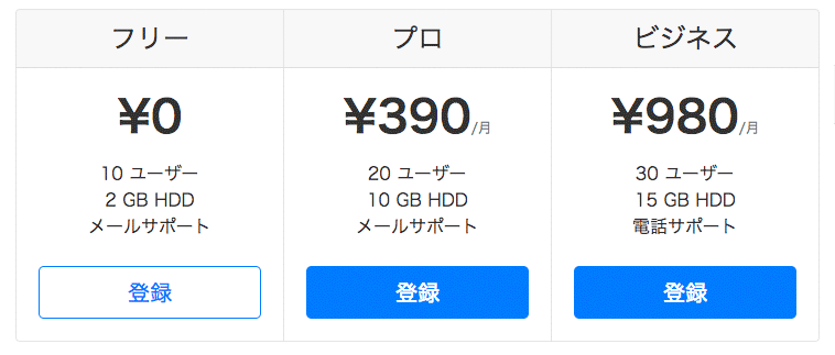
Pricing Tables
You can create a basic pricing table design.
 HTML
HTML
<div class="card-group mb-3 text-center"> <div class="card mb-3 box-shadow"> <div class="card-header"> <h4 class="my-0 font-weight-normal">Free</h4> </div> <div class="card-body"> <div class="card-title"><span class="h1 font-weight-bold">¥0</span></div> <ul class="list-unstyled mt-3 mb-4"> <li>10 users</li> <li>2 GB HDD</li> <li>Email support</li> </ul> <button type="button" class="btn btn-lg btn-block btn-outline-primary">Sign up</button> </div> </div> <div class="card mb-3 box-shadow"> <div class="card-header"> <h4 class="my-0 font-weight-normal">Pro</h4> </div> <div class="card-body"> <div class="card-title"><span class="h1 font-weight-bold">¥390</span><small class="text-muted">/month</small></div> <ul class="list-unstyled mt-3 mb-4"> <li>20 users</li> <li>10 GB HDD</li> <li>Email support</li> </ul> <button type="button" class="btn btn-lg btn-block btn-primary">Sign up</button> </div> </div> <div class="card mb-3 box-shadow"> <div class="card-header"> <h4 class="my-0 font-weight-normal">Business</h4> </div> <div class="card-body"> <div class="card-title"><span class="h1 font-weight-bold">¥980</span><small class="text-muted">/month</small></div> <ul class="list-unstyled mt-3 mb-4"> <li>30 users</li> <li>15 GB HDD</li> <li>Phone support</li> </ul> <button type="button" class="btn btn-lg btn-block btn-primary">Sign up</button> </div> </div> </div> -
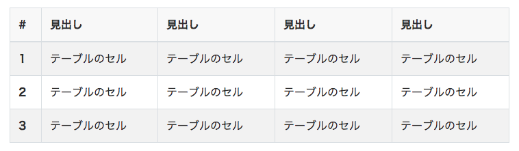
Tables
You can create tables with a variety of designs. See the Tip section for details.
 HTML
Tip
HTML
Tip
<table class="table table-striped table-hover"b>
  <thead class="thead-inverse"b>
    <trb>
        <thb>#</thb>
        <thb>Heading</thb>
        <thb>Heading</thb>
        <thb>Heading</thb>
        <thb>Heading</thb>
    </trb>
  </theadb>
  <tbodyb>
    <trb>
      <thb>1</thb>
      <tdb>Table cell</tdb>
      <tdb>Table cell</tdb>
      <tdb>Table cell</tdb>
      <tdb>Table cell</tdb>
    </trb>
    <trb>
      <thb>2</thb>
      <tdb>Table cell</tdb>
      <tdb>Table cell</tdb>
      <tdb>Table cell</tdb>
      <tdb>Table cell</tdb>
    </trb>
    <trb>
      <thb>3</thb>
      <tdb>Table cell</tdb>
      <tdb>Table cell</tdb>
      <tdb>Table cell</tdb>
      <tdb>Table cell</tdb>
    </trb>
  </tbodyb>
</tableb>
Adding table-striped alternates the background color of the rows.
Adding table-hover applies a background color on mouseover.
Adding table-bordered-none removes the borders. -
Responsive Tables
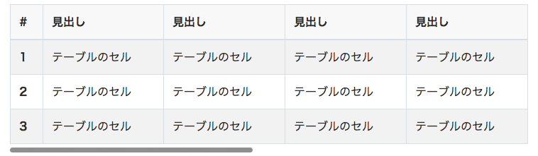
You can create tables with horizontal scrolling enabled. Recommended for tables with many columns.
 HTML
Tip
HTML
Tip
<div class="table-responsive">
<table class="table table-striped table-hover text-nowrap">
  <thead class="thead-inverse">
    <tr>
        <th>#</th>
        <th>Heading</th>
        <th>Heading</th>
        <th>Heading</th>
        <th>Heading</th>
    </tr>
  </thead>
  <tbody>
    <tr>
      <th>1</th>
      <td>Table cell</td>
      <td>Table cell</td>
      <td>Table cell</td>
      <td>Table cell</td>
    </tr>
    <tr>
      <th>2</th>
      <td>Table cell</td>
      <td>Table cell</td>
      <td>Table cell</td>
      <td>Table cell</td>
    </tr>
    <tr>
      <th>3</th>
      <td>Table cell</td>
      <td>Table cell</td>
      <td>Table cell</td>
      <td>Table cell</td>
    </tr>
  </tbody>
</table>
</div>
Wrap the table in a div with table-responsive.
Adding text-nowrap prevents text from wrapping. -
Hero Unit
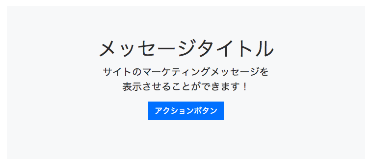
You can create marketing messages and similar content.
 HTML
Tip
HTML
Tip
<section class="jumbotron jumbotron-fluid bg-light text-center">
    <div class="container">
      <div class="h1">Message title</div>
      <p class="lead">You can display your site's<br>marketing message here!</p>
      <p>
        <a href="#" class="btn btn-primary text-white">Action button</a>
      </p>
    </div>
</section>
Placing this as a "Custom HTML" widget in the "Below post page" area will display it on all posts.
-
Tab Navigation
You can create elements that switch between tabs.
 HTML
HTML
<ul id="myTab" class="nav nav-tabs" role="tablist"> <li class="nav-item"> <a href="#home" id="home-tab" class="nav-link btn active" role="tab" data-toggle="tab" aria-controls="home" aria-selected="true">Home</a> </li> <li class="nav-item"> <a href="#profile" id="profile-tab" class="nav-link btn" role="tab" data-toggle="tab" aria-controls="profile" aria-selected="false">Profile</a> </li> <li class="nav-item"> <a href="#contact" id="contact-tab" class="nav-link btn" role="tab" data-toggle="tab" aria-controls="contact" aria-selected="false">Contact</a> </li> </ul> <div id="myTabContent" class="tab-content mt-3"> <div id="home" class="tab-pane active" role="tabpanel" aria-labelledby="home-tab">This is the Home text.</div> <div id="profile" class="tab-pane" role="tabpanel" aria-labelledby="profile-tab">This is the Profile text.</div> <div id="contact" class="tab-pane" role="tabpanel" aria-labelledby="contact-tab">This is the Contact text.</div> </div> -
Menu
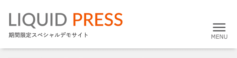
You can add a "MENU" label to the menu icon on the smartphone version.
 Custom CSS
/* Menu */ .navbar-toggler:after { content: "MENU"; font-size: 10px; font-family: Verdana, sans-serif; position: absolute; bottom: -10px; right: 8px; } -
Accordion Menu
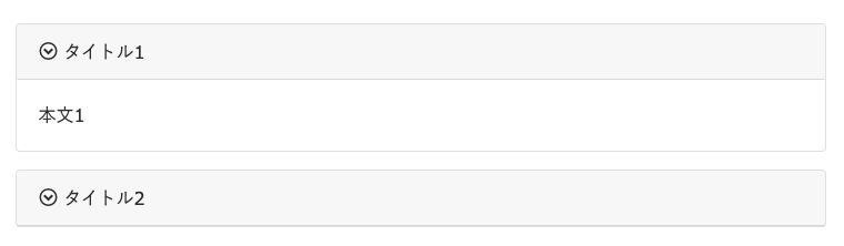
You can create collapsible accordion elements.
 HTML
Tip
HTML
Tip
<div class="card mb-3">
  <div class="card-header btn text-left" data-toggle="collapse" data-target="#collapse1" aria-controls="collapse1" aria-expanded="false"><i class="icon-circle-down"></i> Title 1</div>
  <div class="collapse" id="collapse1"><div class="card-body">Body 1</div></div>
</div>
<div class="card mb-3">
  <div class="card-header btn text-left" data-toggle="collapse" data-target="#collapse2" aria-controls="collapse2" aria-expanded="false"><i class="icon-circle-down"></i> Title 2</div>
  <div class="collapse" id="collapse2"><div class="card-body">Body 2</div></div>
</div>
Change the collapse(number) portion for each collapsible element.
-
Display Utilities
You can configure show/hide behavior in detail for each device screen size.
From smallest to largest: xs, sm, md, lg, xl. To hide something on smartphones, add the "hide on sm only" CSS class.
Examples: show on desktop "d-none d-sm-block", show on mobile "d-block d-sm-none"Screen Size CSS Class Hide on all d-none Hide on xs only (show on desktop) d-none d-sm-block Hide on sm only d-sm-none d-md-block Hide on md only d-md-none d-lg-block Hide on lg only d-lg-none d-xl-block Hide on xl only d-xl-none Show on all d-block Show on xs only (show on mobile) d-block d-sm-none Show on sm only d-none d-sm-block d-md-none Show on md only d-none d-md-block d-lg-none Show on lg only d-none d-lg-block d-xl-none Show on xl only d-none d-xl-block
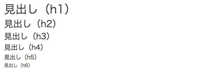
With LIQUID PRESS, you can also use Bootstrap 4 layouts and components.
Some of the designs now support Gutenberg block style designs!